Designing for
easy2C
2022–2024
At easy2C Promotional Products and Calendars, I designed a range of stationery products, including promotional flyers, company forms, and car decals. I also led the redesign of a calendar collection sold directly to consumers, updating their style to create a more modern and visually appealing look.
Car Decal
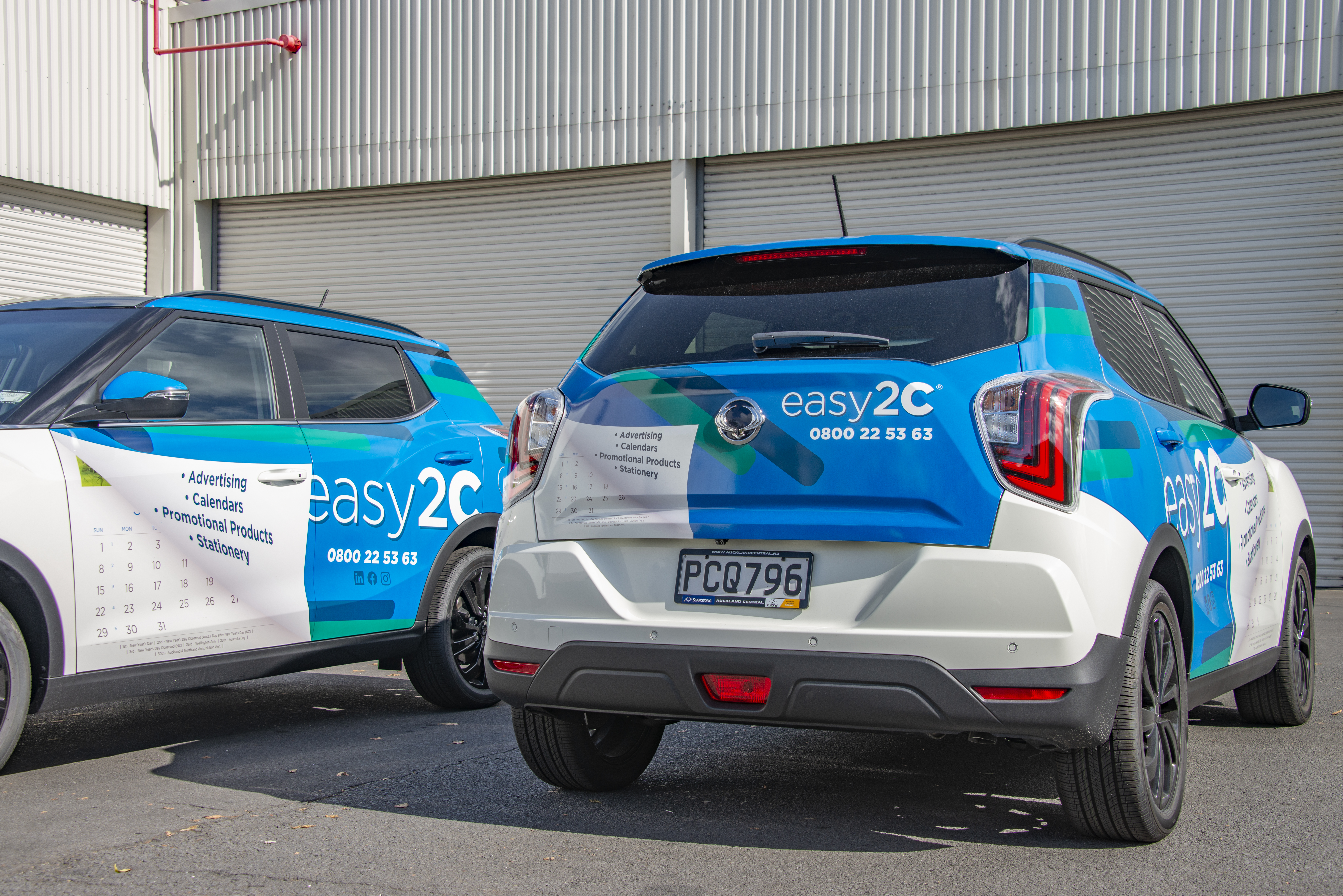
At easy2C, the design team was tasked with creating individual concepts for in-house stationery and advertising. My design was selected for the company’s car decal. Given the company’s focus on calendars and printing, I incorporated a paper-like effect that peeled back to reveal a calendar underneath.
The brief called for a dynamic, eye-catching design, so I opted for a 3D, interactive look to add visual interest. To enhance visibility on the road, I used the more vibrant colors of our branding to contrast against the white car. Angling the logo and pattern further emphasized a sense of movement, complementing the flying paper effect and reinforcing the theme of motion.
Documents
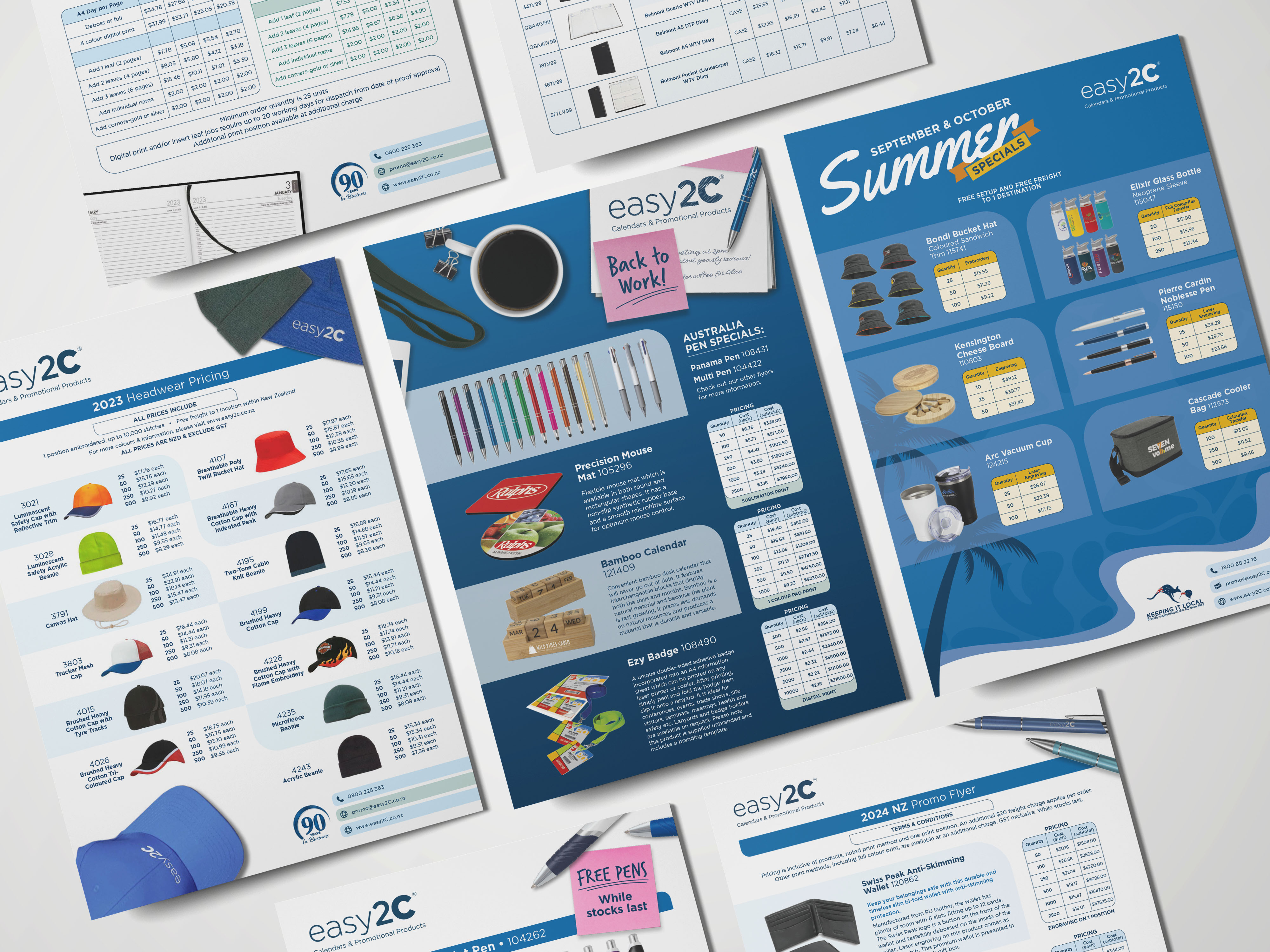
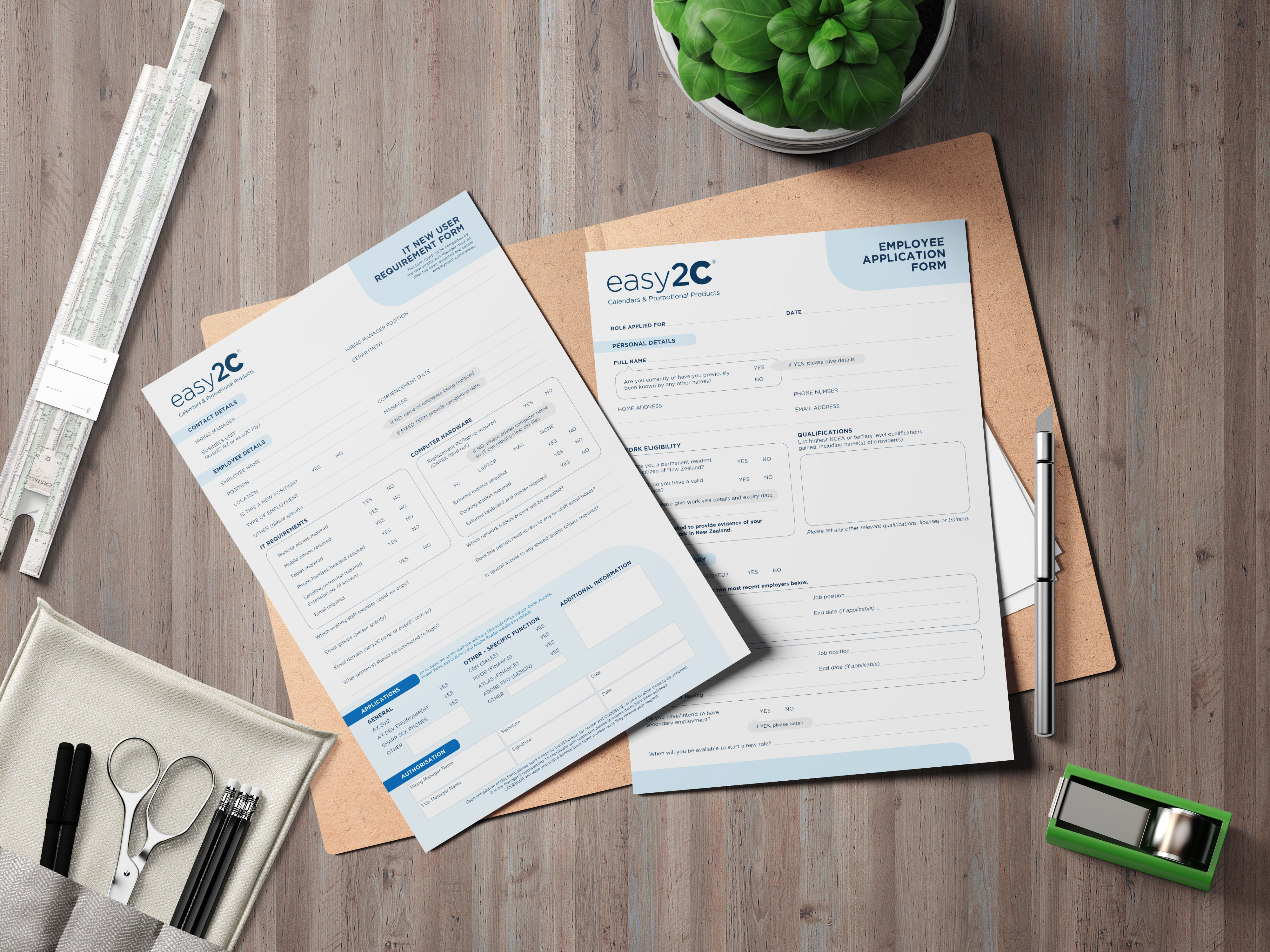
I also designed flyers and company documents, tailoring each to their purpose. For the flyers, I focused on bold, colorful, and eye-catching designs to engage customers. In contrast, I streamlined the company documents, maintaining the same design language while maximizing space for essential information.
To ensure consistency, I incorporated the brand’s signature rounded square shapes and color palette, while allowing for creative flexibility in the flyers to enhance their visual appeal or align with specific themes when needed.
Calendars
Calendars were our primary retail product, and I had the opportunity to redesign several outdated designs. My main goal was to modernize their appearance while maintaining functionality and ample space for note-taking and personalization, as most customers were corporations. Since the designs needed to remain practical rather than overly dynamic or experimental, I focused on aligning them with each calendar’s theme.
For example, I incorporated curves and subtle asymmetry in the nature-themed calendar and used gradients to enhance the light-themed calendar. Leveraging these thematic elements allowed me to create visually distinct designs while preserving the calendars’ usability.